Marketing Design
MARKETING DESIGN
MULTICHANNEL MARKETING: The Waste Wizard!
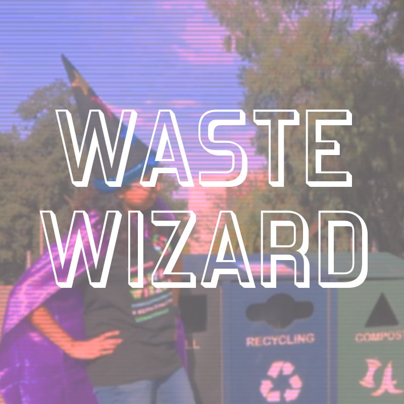
Waste Wizards is a multichannel Zero Waste campaign and ambassador program. In 2017, Cal State East Bay transitioned to a three-stream waste system, replacing a single-bin model. We needed a distinct branding solution that would be instantly recognizable and a way of rewarding students for volunteering as ambassadors. I helped define the brand, designed the shirts and produced a 2 minute video to increase awareness.
My Role: Art Direction, Graphic Designer, Director, Videographer, Editor
Team: CSUEB Office of Sustainability Marketing and Communications Team, Zero Waste Team, #SustainEB Student Club
Design Challenge: How might we better better facilitate Zero Waste education, specifically composting which can reduce landfill totals by 50% if properly diverted?
Solution: Create an educational video that emphasizes the importance of composting using a fun 90’s aesthetic and a desirable wearable for give-aways.
Tools Used: Adobe Premiere & Audition, Illustrator, Multichannel Campus Network: Digital Signage, Closed Circuit Video, @SustainEastBay Social Media
GRAPHIC DESIGN
Our Marketing team wanted to support the the Zero Waste team with their new Waste Wizard program. Wizards dress in cheesy hats and capes and stand by bins at events to educate students on how to properly sort their trash. The Sustainability Office needed to promote the program, but make it fun, too! First I designed a bold, colorful logo type that capitalized on the 90’s retro look (that is so hot right now)! It also matched the colorful costumes we had picked out for our wizards.
Then I built on these designs to create the t-shirt. I wanted to make something that didn’t look like the typical swag you might get from campus clubs and orgs. I had volunteered for some clothing drives at the school and noticed how many t-shirts were discarded from one-off events or days of service. I developed something that would be valued by recipients – something students would want to keep.
And even if they wore it out, I wanted to show the user they could avoid sending more fabric to the landfill. I created this graphic for the back that visually demonstrates how to turn the shirt into a reusable shopping bag.
THIS IS A PUBLIC SERVICE ANNOUNCEMENT
Once the shirts (100% organic cotton) arrived, I wrote, directed and produced a video to help spread the word. The video was designed to look, sound and feel like a public access kids program. I even added scan lines and modified the aspect ratio.
I had fun customizing playing with type treatments and vector graphics.
Add of course, lots of cheesy special effects.
ENGAGEMENT
We deployed the digital content across social media and doubled our volunteer numbers for the spring Day of Service.
ORGANIC GROWTH: Caught You Green Handed
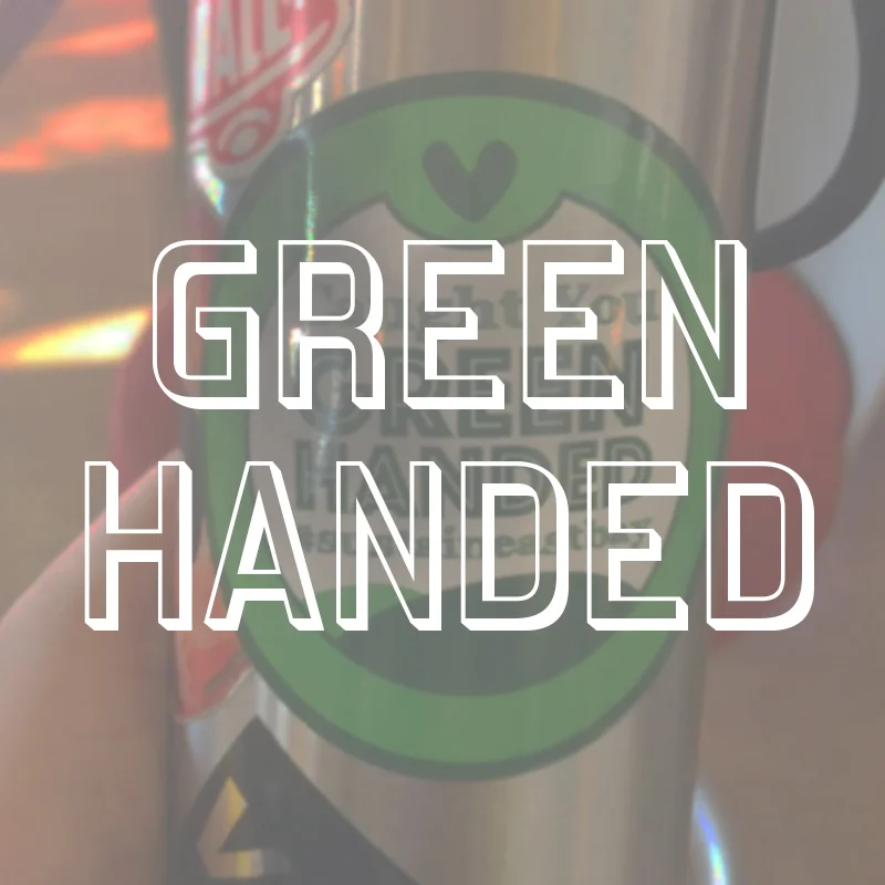
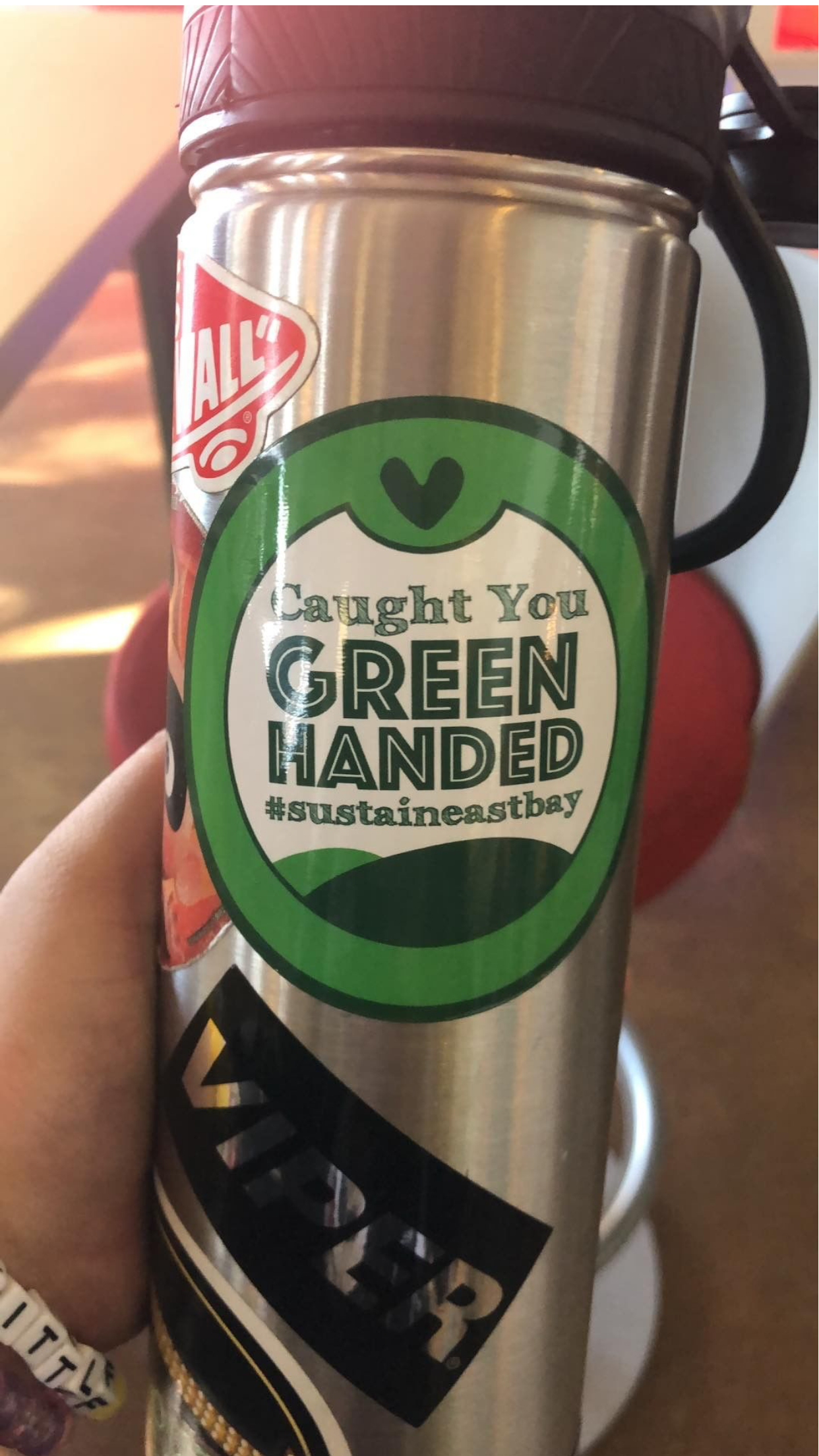
Caught You Green Handed is a multichannel campaign strategy to reward Cal State East Bay students for their every-day sustainable choices. I designed this sticker and helped pilot the program that uses them to grow the CSUEB Sustainability following on Instagram.
My Role: Graphic Designer & Campaign Co-Coordinator
Team: Office of Sustainability Marketing & Communications Team
Design Challenge: Acknowledge how students little choices can make a big impact on the environment and simultaneously bolster our on-line numbers - specifically on Instagram.
Solution: Create a token of appreciation that doubles as a raffle ticket for students. Recipients were “caught in the act” and then encouraged to follow us on social. Follows were captured in database and then entered in a drawing to win a bamboo cutlery set. The added bonus: our hashtag and branding posted throughout the campus.
Tools Used: InDesign, Multichannel Campus Network: Digital Signage, Closed Circuit Video, @SustainEastBay Social Media Network
RESULTS
When we rolled out the official contest, a lot of the pain points had been smoothed. We gained 40 new followers in just two weeks – about 6%. We replicated this success during our 2019 Earth Week celebration and carefully documented the process for future campaigns. In the academic years I spent as Social Media Coordinator for the Sustainability office, our team was able to grow the IG following from just shy of 600 to over 800 followers – thanks to initiatives like these. As a non-profit institution we rely on 100% organic growth strategies
PROCESS
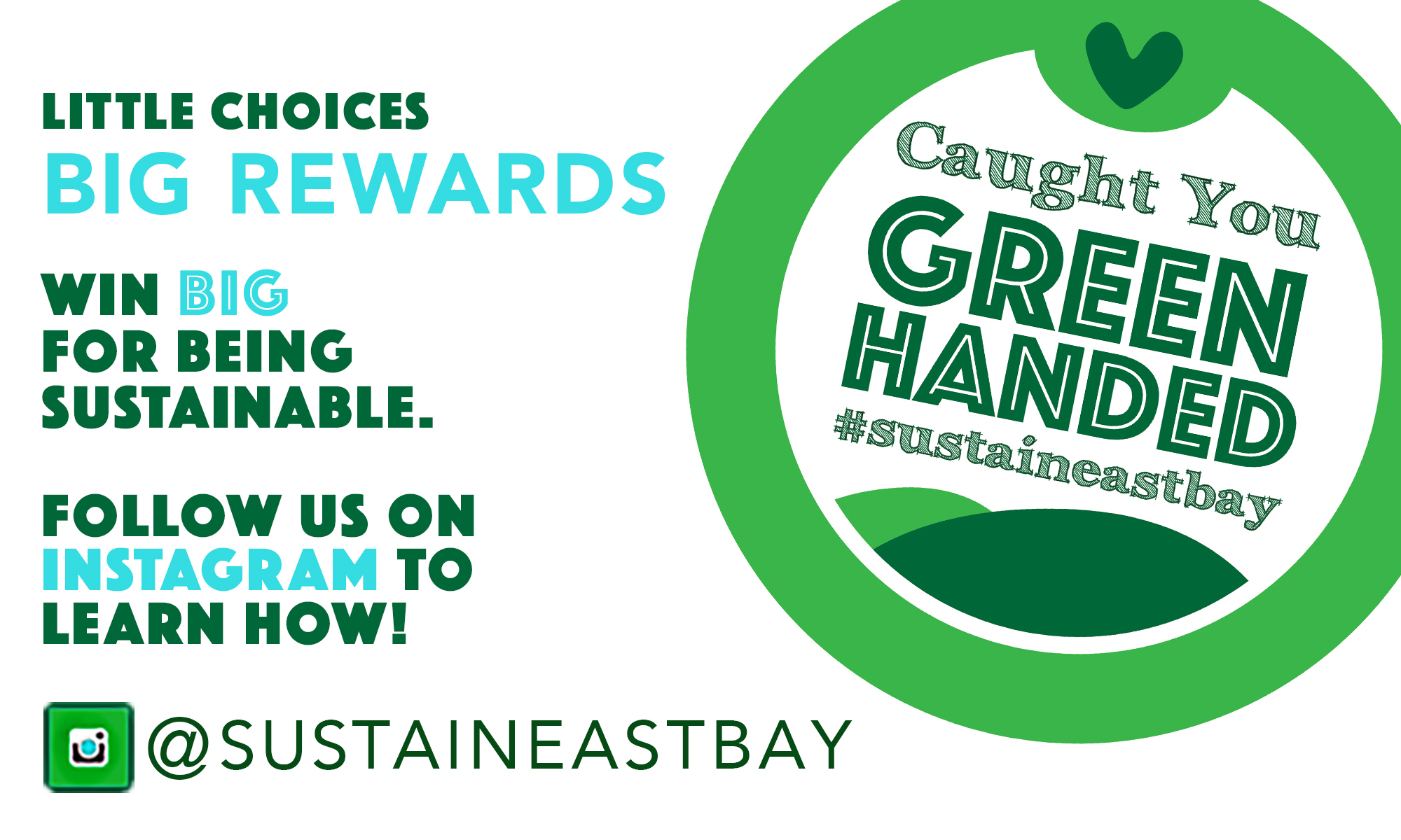
The design process had two main components. First there was developing all the steps to implement the contest like how to engage strangers, tracking the contestants and getting prizes to winners. After lots of planning and testing, I distilled the steps and designed this call-to-action collateral for digital promotion.
GRAPHIC DESIGN
Then there was designing the sticker, itself. I iterated multiple versions of the sticker on paper and in illustrator. “Green Handed” campaigns have been used at other Sustainability organizations, but I wanted anything but the obvious, big green hand. It needed to be simple, readable and a desirable emblem that students would want to show off.
EXPERIENCE DESIGN
When we tested the campaign, we realized there were a lot of kinks to work out. Mainly, how might we observe and and directly engage “green handers” without it being uncomfortable for the recipient. We decided to go out in teams and wear branded clothing, so people knew we were Sustainability Ambassadors. We then let them know that if they followed us on Instagram @sustaineastbay they could be entered for a bigger prize. We also used all the campus media channels available to us to get the word out including the closed circuit television network and the LED digital signs throughout campus.

